Stanford Shopping Center Navigation Rework
UX DESIGN / Test Project
Trying not to be an impulsive shopper, I often check shopping centers’ websites.
When I first visited Stanford Shopping Center I had certain problems in using the navigation presented on its website. Here is my attempt to rework the navigation and filters.
Important note: I am not affiliated with Stanford Shopping Center. This project was a voluntary exercise.
The Challenge
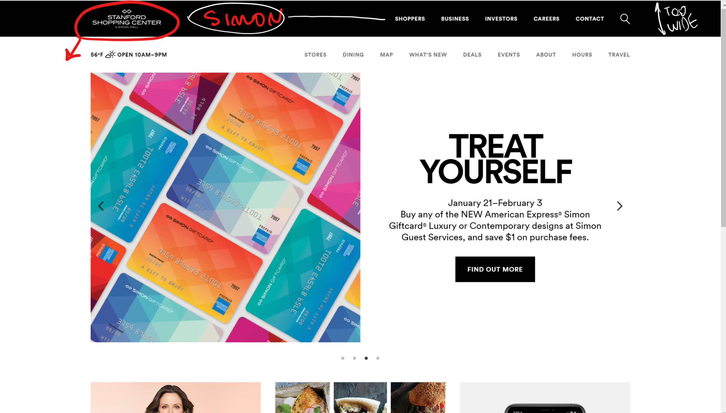
Home page header is confusing, as it shows 2 header lines of equal importance: SIMON and Stanford Shopping Center. SIMON is the group of shopping centers, which includes Stanford Shopping Center. However SIMON navigation bar has Stanford Shopping Center logo located on it, which makes it very confusing for a user.
As I understand the current design was made to save users a click, that’s why the main navigation menu has so many items, however, it might get too overwhelming to see all those options. I will try to regroup some of the items, keeping the navigation simple.
I would like to highlight the terminology throughout the navigation. There are number of cases when terms related to the same item change or their meaning is not very clear. For example term “Map” in the main navigation does not explain if users can access the mall map or the location map by clicking this link.
Filters were not clearly defined and filter menus included a lot of repeated or logically not compatible options. I will try to rework the filters making the navigation more intuitive and efficient.
My Role
UX Researcher
Wireframes and Prototype Designer
User Tester
Tools
Card Sorting
User Testing
Adobe XD
Deliverables
New Navigation Prototype
THE RESEARCH
While various websites use different filters and navigation options, I wanted to make the navigation for the Stanford Shopping Center website smoother, easier, and more defined. To reach this goal I analysed websites of multipurpose stores, shopping centers, and supermarkets. I chose the aforementioned businesses as they all have a large variety of product classes and subclasses.
The most difficult task was to rebuild the navigation hierarchy to simplify it for final users. I used card sorting technique to join some of the navigation items into groups to unload the scroll down menu.
Card Sorting Process
Prototyping Process
final navigation options
New Stanford Shopping Center Navigation Option
The mein navigation option I came up with looks similar to the one Stanfrod Shopping Center is currently using on their website. However, the filter navigation is changed and some of the functionality was added to already existed elements.
One big change I suggest in this rebuild website option is to remove SIMON navigation, as it is very confusing and users do not understand which navigation to use. I think the global header navigation can be moved to the website footer. It is common plactice throughout various websites, which makes it expected by users.
Changing the website terminology was one of my primary goals. For example “Map“ in the menu was replaced with “Mall Map“, which gives users clear understanding of this item. I’ve also replaces the “Stores“ navigation item with “Retail“. Currently the path to this item looks like “Store Type > Store”, which is very confusing for the website users.
As menus and filter options are sometimes repetitive, I made sure to correct those.
What truly made the navigation easier was grouping some of the existing elements. As much I always want to save users a click, the current situation on Stanford Shopping Center website leads to a massive scroll down menu of items sometimes logically not connected to each other. That is why grouping of certain items here adds a click but predicts users’ activity.
Additional Navigation Idea
To be fair I was very careful while creating the aforementioned menu as I did not want to alternate the current website’s data.
However, I do think that the navigation can be simplified even more. The digital sketch on the left demonstrates the possible modified filters navigation.
This option shows clearer space and more specific search results. It is easy and fun to use and would work smooth on any desktop and mobile.
lessons learned
A website’s navigation is one of the most difficult and valuable detail in the whole project.
Poorly organized navigation can be a reason of low website conversion.
The best way of choosing the right navigation for a particular business is user testing.
If you work for Stanford Shopping Center and want this page to be removed, please contact me.


