Region Made
LOGO DESIGN
With the desire to share their authenticity and creativity of Australian makers I created this new logo for Region Made.
Region Made is a curated online marketplace connecting designers and makers in regional Australia with a nationwide customer base.
Being a local brand, Region Made has its authentic warm feeling, which I wanted to communicate with the final user.
my role:
Researcher
Logo Designer
Illustrator
the challenge:
The founders of Region Made are two lovely ladies, who grew up in Western Australia. Being in love with style they found it strange that so many amazing local Australian makers don't know how to share their craft and promote their creations. This is how the idea of a specific marketplace was born. The main goal was to keep the rustic feel of the logo, without making it too "village'y". Girls wanted to communicate the female energy as well as the origin of the produce - Western Australia.
tools:
Invision
Adobe Illustrator
Pen/Paper
deliverables:
Four Logotype Options
Fonts
Color Palette
region made character:
feminine
rustic feel
minimalism
authenticity
What users would like to see in this logo:
warm colours
connection to nature
vintage touch
easy to read
the research:
Region Made is a marketplace which will connect a creator with a final user. The fundamental aspect of this connection is conscious consumerism. People are thinking harder about their purchases and getting stricter on their buying decisions, often preferring to buy something locally designed/ made or produced in a small batch. There has never been a better time for regional brands to move into the spotlight!
During my research I focused on brands which have similar values as Region Made. Mostly I analysed home ware, health, pottery, design, farm produce brands.
Region Made Sketches
User Interaction with the logo:
the hand drawn logo immediately sends a message of something cozy and handmade
women found the style cute and romantic - men found the style feminine and soft
people living in small towns found the style vintage but stylish It was good to see that the logo is clear to users with various backgrounds.
Short Region Made storyboard
With the help of my client I established the final elements of the logo:
female hand (as a symbol of hand crafted products)
barley grain (as a symbol of Western Australia)
frame (as a symbol of the marketplace connection)
colors:
Even though final color palette was defined by the client, I would like to present the logo in colors suggested by me.
fonts:
final project:
In conclusion I presented one main logo and 3 alternative logo options, which all interact and can be used depending on a certain context.
Main logo is full framed female hand holding barley.
Two monogram logos to use on documents and smaller stickers.
Typographic logo to use on small prints or small digital banners.
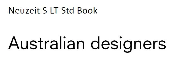
I presented fonts for web and print use.


Lessons Learned:
Never forget about the final user of the design. This time the final users were not only clients, who mostly live n large cities and feel hungry for a romantic rustic feeling, but also the creators, who wants to associate their produce with Region Made brand.
Sometimes logo can include more details without being overloaded.
User understanding of goals and values can be communicated through shapes and colors, so it is important to send the correct message.


